Time to bring the week 3 exercises (Gephi SNA part 1 and part 2) together for week 3 assessment, asking us to “compare the two networks (Twitter vs. blogs) for week 12 of CCK11” (for description of the data set see part 1).
Health warning – this is a rather an amateurish effort and felt more like telling stories than drawing hard conclusions. But – hey – from what I have seen so far much SNA stuff is very much about “just so stories” and rather overimaginative interpretation of patterns and associations. If you were to believe the rumours, such approach should be a familiar territory for an evolutionary biologist like me…and so the process made me feel almost at home;)
Density and centrality measures
Twitter network had slightly lower density but slightly higher average degree than the blog network (0.001 vs 0.03; 2.7 vs 2.01).
Density was quite low in both networks, pointing to low level of overall community integration and low potential for spread of information. However, it seems that blog network would have a marginal advantage over Twitter here.
Low density indicates that using either system for important announcements would be inefficient. Participants or subgroups may feel isolated from the others and may find it difficult to find relevant information or connections. The slight differences in density and centrality may be a result of the inherent properties of the two tools. Twitter is inherently easier to use for quick communication and making connections due to the low level of effort required to post in comparison to blogs. The latter allows for more in depth exchanges.
But I immediately want to ask – what were the course team strategies for use of the two communication tools? Did these strategies have an impact on the network characteristics? Did they override or aide the influence of the tool affordances?
Broker and central node overlap
Identify any any overlap in the main brokers and central nodes across the two networks?
What does it mean to have brokers and central nodes in common for both networks?
If you haven’t identified central nodes in common for the both networks, what does it mean in terms of integration of different social media used in a single course?
Now – I had fun with this one (and of course spent disproportionately too much time on wrangling the data and the software into semi-submission). As formal analysis for this type of question was not covered in the lectures, I assumed that identification of “any overlap in the main brokers and central nodes across the two networks” was to be done by eyeballing alone.
OK – so I discovered that the unique id for each participant was coded in the label column within Data Lab.
I could display Labels on nodes with highest betweeness scores (the brokers) and highest centrality scores in visualisation of each network and simply check if they are the same.
But anonimisation meant that the identifiers were long strings of alphanumerics. Not so easy to eyeball and compare for multiple brokers and central nodes then. Especially, that Gephi does not support side-by side display of the network plots! Wouldn’t it be nice if on highlighting a node with a particular ID (or in this case Label) in one network it would get highlighted it in the second one?
OK – another idea was to dump both datasets in Excel and then use simple sort by value of betweenness and centrality and check if there are any nodes in common among the highest values. Notwithstanding the issue of comparison of long strings by eye, this would definitely loose the power of visualisation in presentation of my conclusions.
Ideally, I would want to display the nodes shared between the two networks within each diagram. Even more ideally, I would like to heatmap betweeness of the second network on the first one where nodes were sized according to the same measure. I would simply have to import the values for the second network into the Data Lab spreadsheet of the first one and use them for node colours!
This did not turn out to be as easy as it sounded….mostly because of idiosyncrasies of Gephi (oh the joys of hands on problem-based discovery of new software!). This is what I did to produce a heatmap of blogger betweenness onto the Twitter network (and it does sounds soo basic when you put it down like this):
1. I exported spreadheet of Twitter and blog network from Gephi Data Lab.
2. I joined the two in Tableau with left hand join (i.e. all Twitter nodes were preserved and data added only for the blog nodes which occurred in BOTH networks). Making sure that the join was on Label (unique ID for each participant).
3. Selected the whole joined data table in Tableau and copied into Excel.
4. In Excel I deleted all the columns corresponding to the Twitter data (except from the Label in order to cross check IDs after import to Gephi). I also replaced all the nulls in the missing blog data with -40. Replacement was necessary as Gephi does not recognise columns with empty cells as valid for visualisation, and you cannot use letters as it misclassifies the data. I chose value of -40 as this was not a real value and was low enough to be able to select a cut off when colouring the nodes. Horrible hack I know! Saved as csv.
5. Imported spreadsheet into Gephi’s existing Data Lab spreadsheet for Twitter. Surprise, surprise, had to change data types for the imported columns (during the import!). It turns out that Degree, Component ID and Modularity Class are integers, but Eccentricity, Closeness and Betweenness are double. Don’t ask how I figured it out!
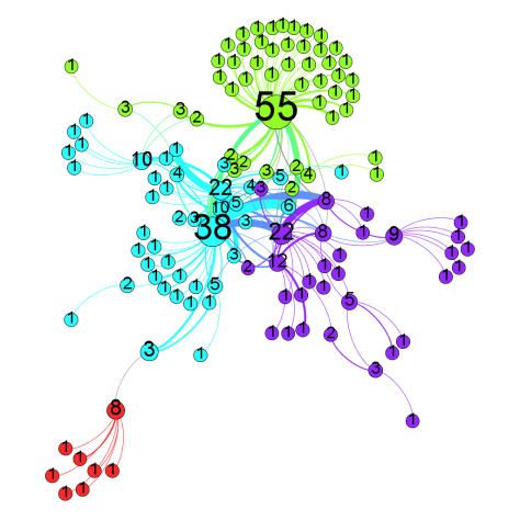
6. Now I sized the nodes of the Twitter network on Twitter network betweenness, and used betweenness values for blog network to colour the nodes (placing cut off point above -40 and as close as I could get it to +1ish). Here is the pretty picture:

Now – all this fiddling did not leave much time for interpretation. (I also did not have time to do the same for blogs or centrality)
But here goes.
62/194 (32%) of participants who either blogged or commented on blogs also tweeted using the course hashtag. This indicates that at least some participants actively communicating via online social networks, tended to use more than one network. The bloggers were more likely to use both (32% of bloggers overlapping vs 7% of Twitter users). This is not surprising, since Twitter is often used to advertise new blog posts by bloggers and many Twitter participants would visit and comment on those blogs. Tweeting is much less demanding in terms of time and effort, hence majority of participants chose to only Tweet.
Now to the brokers. It appears that the participants with the highest betweenness centrality within Twitter did not have the highest betwenness in the blog network. There were 2 or 3 exceptions for slightly lower values – shown in mid-green within the figure.
Without knowing more about the nodes it is difficult to draw any meaningful conclusions. One conclusion may be that nodes with high centrality and betweenness on Twitter are in fact course coordinators who try to engage in exchanges with wide range of participants and retweet their contributions to spread their ideas to their own networks. It is not common for course leaders to also blog extensively, hence they would not have a similar position in the blog network.
A couple of participants with relatively high centrality in two networks may be course leaders who engaged in extensive commentary on multiple blogs. Or course participants whose communication strategy was similar within both networks.
Not really possible to confirm this without knowing more about the nodes here…
Either way – I like the idea of having different “dominant” nodes in different social spaces. It allows for greater diversity of conversation across them. For example, if Twitter was in fact course leader-centric, blogs would be providing a more student-led environment. It would really be interesting to see what the course organisers envisaged for these spaces!
And can we really make any conclusions without seeing the lurkers – followers who do not comment or retweet. Excluding them from the analysis instantly devalues the act of witnessing or reading as an invalid form of interaction and learning. And yet the lurking rule of thumb seems pretty invariable across various media. I wonder how lurkers with high betweenness centrality measure up to active communicators on the creativity and innovation scales;)
Communities
Compare the number of the communities across the two networks and check if there are some potential similarities;
Try to provide interpretation for the findings
What implications can you draw based on the modularity analysis and the communities identified in the two networks?
OK – I think I run out of steam here. Twitter has many more communities as measured by modularity analysis as described here (12 for Twitter and 6 for blogs on default settings). I suspect this has to do more with the relative size of the two networks but I may be wrong. It is also possible that the blog community network is a reflection of a few bloggers receiving many comments on their posts this week. In this case each blog post would form a mini-community hub. Again – hard to check this without having more insight into the data.
In terms of overlap in communities for Twitter and blogs – I would say there is very little evidence of this. I used the combined dataset as per description above to get this pretty picture.
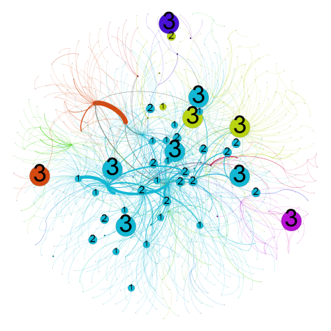
It looks like many of the blog “communities” are represented within the largest “community” on Twitter. Some of the Twitter communities are not represented within blogs at all. As per above – no time for the equivalent analysis within blogs.
As per centrality measure discussion earlier this indicates that Twitter and blogs networks are different. As for underlying reasons and effects of this difference – hard to say…
Application of the analysis to other educational contexts
Reflect on the possible educational contexts in which you would apply similar analysis types. Of special importance would be to identify the learning contexts that are of direct relevance to you such as work (e.g., teaching), study (e.g., courses you are taking), or research (e.g., projects). Discuss possible questions that you would be able to address in those contexts by applying the analyses used in this assignment.
Some defend evolutionary “just so stories” as valid hypothesis making – the trick is to get at the ones which can actually be falsified, and then get some hard data behind them. So for me to be believable I would like any SNA married up with multiple sources of data from the same experimental/observational set up – and across some contrasting ones. So for example, in addition to the communication pattern data available here I would like to have access to the media use strategy in the course, characteristics of the course cohort as well as some additional data from surveys/interviews as well as participation/survival logs. Oh – and wouldn’t it be nice to have data from multiple instances of the cMOOC, perhaps with some careful variation in the baseline conditions:)
Most importantly, there should be a clear question – why are we looking for patterns here, what patterns would we expect to see? Perhaps the question could be related to aspects of social presence (as per the Community of Inquiry model) and impact of the use of Twitter vs blogs as a communication medium in a cMOOC course. Apparently, there is already an existing and validated questionnaire relating to this framework which could come in quite handy for collection of data additional to logs of social interactions:)
Oh – and I would definitely be interested in exploring any formal comparison measures/methods/statistics which facilitate multi-network comparisons and their visual presentation within SNA graphs… Just sayin’
Top image: By Tambako The Jaguar


